Pantone: Colors for Spring Summer 17/18
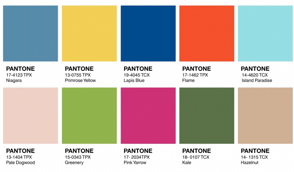
As Fashion Week in New York comes to an end, Pantone gave it´s analysis of color for the upcoming Spring and Summer seasons 2017-2018, identifying the ten most seen colors in this latest edition of NYFW.
This time vibrant colors prevailed, because of the influence of Active Wear in Ready-To-Wear collections.
The first color is chosen Niagara, a shade of blue denim together with Lapis Blue and Island Paradise, continues the supremacy of blue in recent seasons. As a second color we see a vibrant yellow inspired by flowers of Onagra Primrose Yellow, present in the collections of DelPozo, Simon Miller and Hermés, among others.


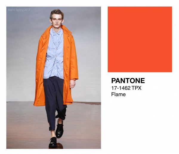
Lapis Blue is a pure and deep blue inspired by the color of lapis lazuli, which in some collections was contrasted with orange Flame, a color we also saw in the collections of Tory Burch, Balmain and Marni.

As renewal of the 2016 colors Rose Quartz and Serenity, Paradise Island and Dogwood Pale appear.
Greenery and Pink Yarrow are the couple of more vibrant colors in this palette contrasting with the last of the list Hazelnut Kale that follows the trend of neutral colors almost shown as much as denim last season.
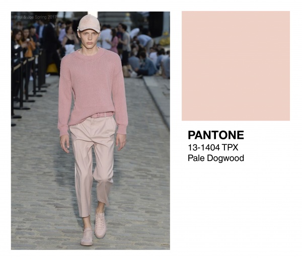
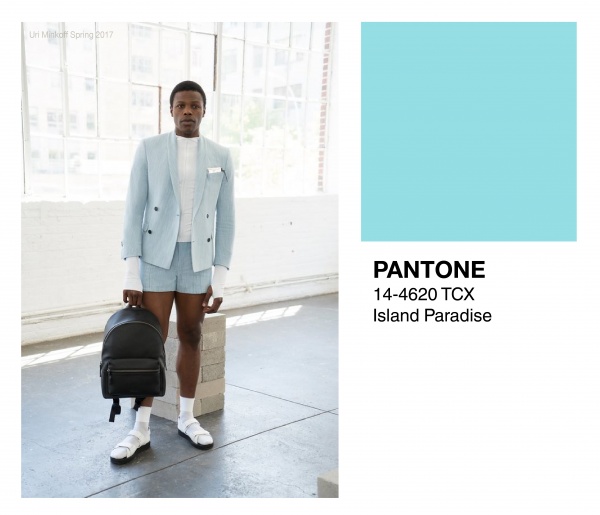
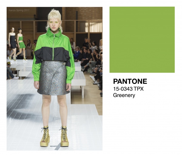
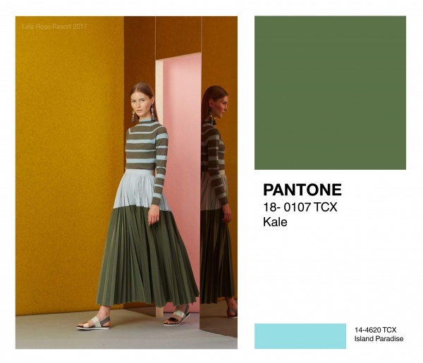
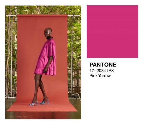

Photo credits: Vogue.com